|
case study |
Just Try It Once – (very) early evaluation |
|
||||||
|
||||||
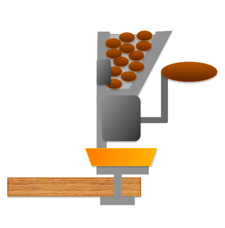
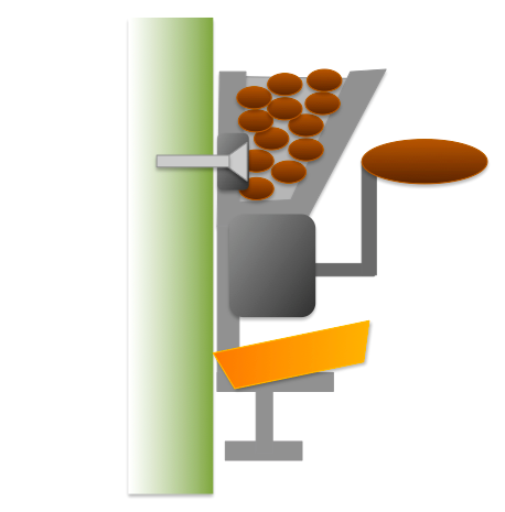
see Chapter 9 EvaluationHopefully you have learnt the lesson that you need to look always to real users both when working out what you want to design and to evaluate applications and devices. It is far too easy to design things that seem good to you but are incomprehensible to the real users. However, that does not mean it is not worth trying things out yourself too! Sometimes all it takes is trying something once to realise it just does not work. This case study is not actually anything digital, but about an antique-look cast iron coffee grinder, not unlike the (real antique) one in this photo.
The coffee grinder was designed so that it could be clamped onto a table (as above) or screwed onto the wall. If you look carefully at the photo, you can see that this one also has pre-drilled lugs to fix to a wall. The grinder in the photo has a small black tray beneath the bean hopper and grinding mechanism to catch the ground coffee. Our new coffee grinder had a shiney brass tray that sat craddled on two small black metal arms. It was bought, brought home from the shop, and we tried it out clamped to the kitchen table – perfect.
All that I needed to do was to drill a few holes in the wall We held it to the wall, checking it was in the right position, with plenty of room to turn the handle, and then we tried putting the tray in place.
Ooops! The way the little tray sat on its supports, it projected slightly behind the line of the back of the coffee grinder. This was perfectly fine when clamped to the table, but when flush aganst the wall, the tray no longer fitted. We considered various fixes, gouging a slot into the plaster of the wall, so that the tray would fit, or adding a wooden spacer block to bring the grinder clear of the wall ... but none were good solutions. We took it back to the shop. There were clear easy adjustments that could have been made to the design: the tray could have been fitted slightly further forward, the manufactuers could have supplied ready-made spacer blocks (cast iron or even black plastic coloured to blend in). However, it was absolutely clear that no-one at no time in the whole design and marketing process had ever screwed the grinder to a wall and attempted to grind coffee. The coffee grinder only had two modes of operation ... and they had failed to test one of them. In terms of the desire and disaster spectrum, this is definitely a disastrous fault – a show stopper. Interestingly, the shop that we bought it from is a big store which seems to test out the products it sells. As they are not the manufacturer, this would be quite close to a user test, but of course the shop staff will have only tested it in the clamp-to-table mode to avoid drilling holes in their office (or maybe kitchen) walls during testing. When you user test, are there modes of operation you miss out because they are too complex or time intensive? But even if this fault had been found during user testing, it would have been late in the process. At minimum it would have wasted testing time, at worst the manufacturing might already have become fixed and they would only gave been able to have a late 'fix' (such as additional plastic spacers). It should never have got that far, it is an obvious fault as soon as you try it out... are there similar faults in the applications you have designed? Of course, you still need to do full user testing, but before you do, to avoid real bloopers like this, you only have to ... just try it once!
Alan Dix © 2017 |
|