
|
online! |
As others see - colour blindness |
|
||||||
|
||||||
|
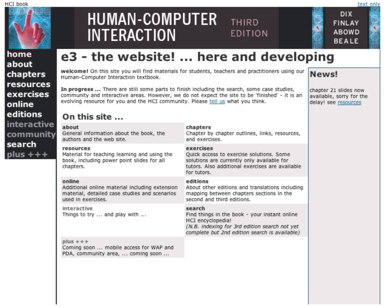
About 10% of men and less than 1% of women will have some degree of colour blindness. That is certain colours that are different to 'normal' sighted individuals will look the same, or at least be harder to discriminate. Colour blindness is caused because one of the three types of cones is in some way not functioning properly. The most common form is red-green colour blindness which means that red and green colours look the same. The chances are about 20 times lower for females as most forms of colour blindness are inherited and recessive (women may be carriers of the gene without exhibiting it). Colour coding can be useful, for example red for warning or danger signals. So catering for colour blind users does not mean designing in black and white! However, you should be careful to ensure that interfaces and web pages are visible for those with different forms of colour blindness.
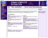
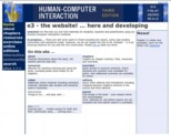
These are good design rules for non colour blind users too; in poor lighting conditions everyone's colour discrimination is less good. Also when printed on a black and white printer, text and diagrams that rely on colour as the sole means of discrimination will be unreadable. The images below show the hcibook/e3 home page as it would be seen by someone with red-green colour deficit (deuteranopia) and with blue-yellow colour deficit (tritanopia). Happily the pages are quite clear for both! This is because we have used font colours with high contrast against their respective backgrounds: black/grey against white, white on dark blue, bright yellow on dark blue.
Figure 1. How the e3 home page appears
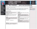
if you are colour blind These images were created using the tools at www.vischeck.com (see sidebar), which attempts to give an accurate view of the appearance to different kinds of colour deficiency. In chapter 5 we suggest a 'quick and dirty' technique to check your pages - simply viewing them in greyscale. This is not perfect as the way our eyes transform colour into darkness is not the same as a simple computer transformation, but it is a good rough guide. Figure 2 shows the e3 home page in greyscale ... and it is quite readable :-)
|
|
