Human-Computer Interaction 3e Dix, Finlay, Abowd, Beale
Trust is a fickle thing, hard to build up, but so easy to lose. It is crucial for all websites, but particularly those that involve money or personal data and reputation including social networks. This case study concerns the first stages of use of an academic social network site. We look through the factors that build and lose trust. Social networking web sites depend on viral growth, if potential users are lost in the early stages, then the growth of the community is threatened.
Alan talks abut the experiences discussed in this case study
The experience here was when Alan first visited the ReasearchGate web site. The quotes are from Alan.
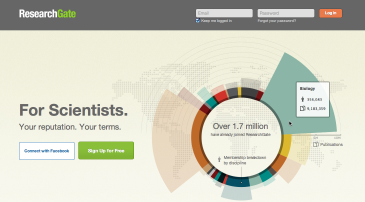
"There is a proliferation of academic social network sites, so I tend to ignore most of these, however I had had a number of invitations from friends and colleagues for a new site called ResearchGate, so decided to check it out. The site itself looked good, clean design, but also an interactive infographic that allowed you to see how many people had signed up in different academic disciplines."
So far, so good. From this we can see two factors that can encourage trust. First there was the recommendations of colleagues: people are crucial in building trust, especially for social sites. The second factor is the positive impact of aesthetics and early user experience. When you have been using a system for a while, you may get used to quirks and not really notice whether it is well designed visually – however early on this is a strong indicator of underlying quality, hence building trust in those who created the site.
"While usually ignoring these sites, the combination of colleagues' joining requests and the site's design values made me click the 'Join now for free" button in one of the invite emails. Initially all went well, the join up page had been largely populated with information gleaned from colleagues and publications: my name, initials, email address were already there, all I needed to do was chose a password. I did this and then came to a page that said "Please confirm your Authorship", but simply had a big blank box in it. I had no idea what to do, maybe copy in some references, the url of a paper? I decided to skip this stage and clicked the "Continue" button. Then disaster, a page full of JSON - gobbledygook."
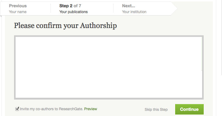
"Please confirm your Authorship" page during signup
First of all we are seeing a usability problem. The user is presented with a blank box and has no idea what to do. In fact it turns out this box should have been populated with a list of papers that the systems believe belong to Alan, but for som reason, probably a momentary delay in the networks, it was left blank. However, networks do get delays, espeecially now when so much internet access is via mobile devices. The first rule whenever there is the possibiity of delay is to put some sort of status indicator perhaps a "loading ..." message or spinner. It is easy to forget this when testing a site as developers' machines and networks all tend to be fast, so well worth testing on a 2 year old medium-range machine and using some technique to artificially slow the network.
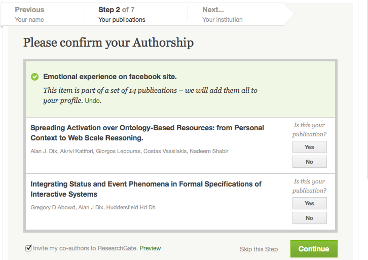
What Alan should have seen at sign up!
This poor usability starts to lower Alan's confidence. This is then followed by the complete failure when the "Continue" button is pressed. The web page is showing a small fragment of JSON, presumably an output that is designed to be interpreted internally by the JavaScript in the browser, yet for some reason shown directly to the user. It may be the initial cause of this failure was the same network delays or disruption that lead to the blank publications box, but whatever the reasons that caused it the effect on the user was disastrous. This is a major engineering failure. As well as preventing Alan from continuing, the engineering failure reduces his belief in the quality and integrity of the system; he loses trust.
"I had given up on the system, but then a while later when looking at my email, I found a message from ResearchGate confirming my registration. Although the front-end web site had gone wrong it had actually registered me. Given the recommendations of colleagues, I decided to give it another chance. This time all went well, and I was presented with a page that offered my publications to accept or reject."
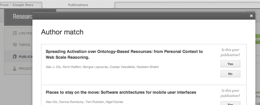
A list of publications, from those previously submitted by colleagues.
"They were all fine, but when I clicked "Yes" for one of them, the page said "This item is part of a set of 18 publications – we will add them all to your profile". I thought "what 18?" is it going to add all of a colleague's publication list as if they were mine? Or is it just sort of 'friending' me to them?" – I had no idea. It didn't offer to add them in addition to the one I had asked for, just said to was going to add them all. I couldn't say "no just the one I asked for", so I did the only other thing it allowed me to do, I pressed 'Undo" ... and I have not gone back to the site since. Maybe I will in the future, especially if I get further emails from colleagues in the site, but for now I'm leaving it."
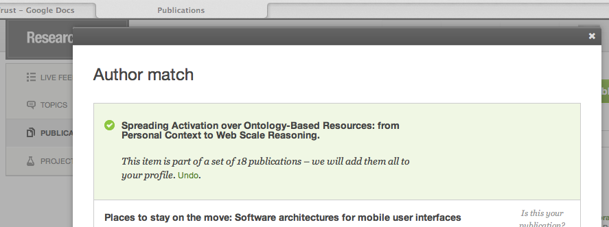
"This item is part of a set of 18 ..." – "do I want these included?"
Here the presence of the email raised Alan's confidence just enough to get him to try again. Things looked good for a while, but then he was faced with an aspect of the site he did not understand. It may be that it was all OK – indeed his friends seem to be using it. If his previous experience of the site had been better, he might have just trusted it, but after the early crash his confidence in the site was at rock bottom. Faced with something he didn't understand he interpreted it badly and backed off.
There are two final, very important lessons here, the first is transparency, making it clear to the user what is happening and why. If the message had had a little 'explain' or 'tell me more' link that opened up a pop-up explaining what it meant perhaps it would have been fine, but as it was Alan was left with no idea of the consequence of adding these 18 publications to his profile. The other lesson is context, we interpret our current experiences based on our current level of trust and confidence. If faced with an ambiguous or uncertain decision and in a state of low confidence, we interpret it as being something bad. Exactly the same uncertainty when we are in a positive mood may be interpreted positively.
For the time being the site has lost a potential user.
N.B. see also update in side bar.
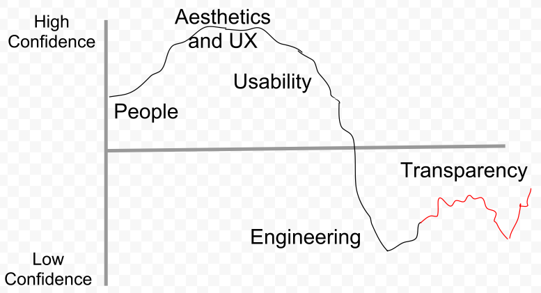
Graph showing Alan's level of confidence in the web site
over time with the trust factors at each point
Alan Dix © 2012