EXERCISE 8.1
In contrasting the read-evaluation loop
and the notification-based paradigm for interactive
programs, construction of a pre-emptive dialog was
discussed. How would a programmer describe a pre-emptive
dialog by purely graphical means? (Hint: Refer
to the discussion in Section 8.5 concerning the shift
from external and independent dialog management to
presentation control of the dialog.)
answer
Creating a pre-emptive dialog by graphical
means is quite simple. In a graphics-based interaction,
it is assumed that the user can only interact with
parts of the system that are visible. In a windowing
system, for example, the user can only direct input
to a single, currently selected window, and the only
means of changing the selected window would be by
indicating with some gesture within that window. To
create a pre-emptive dialog, the system can produce
a window that covers the entire screen and make it
the currently selected window. All user input would
then be directed to that window and the user would
have no means of selecting another window. The 'covering'
window thus pre-empts any other user action except
that which it is defined to support.
EXERCISE 8.2
Look ahead to the example of the state
transition diagram for font characteristics presented
in Chapter 16 (Section 16.3.3). Compare different
interaction objects that could implement this kind
of dialog. Use examples from existing toolkits (pull-down
menus or dialog boxes) or create a novel interaction
object.
answer
In the example, we want to allow the
user to toggle between three font characteristics
- bold, italics and underline. Pull-down menus and
dialog boxes are the most frequently used methods
for implementing such a dialog. A pull-down menu would
have the three choices listed with some way of indicating
whether the characteristic was active or not. Upon
each invocation of the menu, the user could change
the active status of one font characteristic. For
example, they could turn on the bold feature or turn
off the underline feature. The important feature of
this dialog is that more complex tasks (changing the
active status of two or more font characteristics)
can only be achieved by separate invocations of the
menu. And often the only way the user can check the
status would be by popping up the menu again (without
invoking any action). This last point shows that the
menu design alone does not support immediate display
of relevant state changes as discussed in Chapter
7 under the synthesizability principle.
Within a dialog box, the user can effect
several changes at one invocation. Technically, it
is not the dialog box interaction device that allows
for this, but the use of toggle buttons. Each font
characteristic is represented by a box that acts as
a simple on/off switch for that characteristic. As
an aid to the user, the toggle button can change its
appearance so that the user can know its status (on
or off) by looking at it. A similar interaction widget
is the checkbox, which would be labelled with the
particular font characteristic. Clicking on the checkbox
would put a mark in the box to indicate that the characteristic
is on. Another click would remove the mark. In fact,
a dialog box need not be used to portray the set of
toggle buttons or checkboxes, as they could be presented
continually so that the user can always view the current
font characteristic settings. The reason a dialog
box might be used is that there may be many font characteristics
to choose from and the dialog box will keep them grouped
together and preserve screen space by allowing them
to be hidden and used on an as-needed basis.
EXERCISE 8.3
This exercise is based on the nuclear
reactor scenario at: www.hcibook.com/e3/scenario/nuclear/
(a) In the Seeheim model: Treating the
Application Interface model and Application together,
there are three main layers:
(i) presentation/lexical
(ii) dialogue/syntactic
(iii) application/semantic
For each of these three layers list at
least two different items of the description of the
nuclear reactor control panel that is relevant to
the level (that is at least six items in total, two
for each level)
(b) There are no items in the description
that relate to the switch (rapid feedback) part of
the Seeheim model. Why do you think this is the case?
answer available for tutors only
EXERCISE 8.4
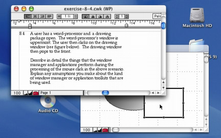
A user has a word-processor and a drawing
package open. The word-processor's window is
uppermost. The user then clicks on the drawing window
(see figure below). The drawing window then pops to
the front.
Describe in detail the things that the
window manager and applications perform during the
processing of the mouse click in the above scenario.
Explain any assumptions you make about the kind of
window manager or application toolkits that are being
used.

answer available for tutors only
EXERCISE 8.5
A designer described the following interface
for a save operation.
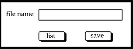
The users initially see a screen with a box where
they can type the file name (see screen 1). The screen
also has 'list' button that they can use
to obtain a listing of all the files in the current
directory (folder). This list appears in a different
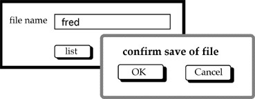
window. When the user clicks the 'save'
button the system presents a dialogue box to ask the
user to confirm the save (see screen 2).

screen 1

screen 2
Two programmers independently coded the
interface using two different window managers. Programmer
A used an event-loop style of program whereas programmer
B used a notifier (callback) style.
(a) Sketch out the general structure
of each program.
(b) Highlight any potential interface problems you
expect from each programmer and how they could attempt
to correct them.
answer available for tutors only
 |
Scrolling is an effective means of browsing
through a document in a window that is too small to
show the whole document. Compare the different interactive
behaviour of the following two interaction objects
to implement scrolling:
A scrollbar is attached to the side of
the window with arrows at the top and bottom. When
the mouse is positioned over the arrow at the top
of the screen (which points up), the window frame
is moved upwards to reveal a part of the document
above/before what is currently viewed. When the bottom
arrow is selected, the frame moves down to reveal
the document below/after the current view.
The document is contained in a textual
interaction object. Pressing the mouse button in the
text object allows you to drag the document within
the window boundaries. You drag up to browse down
in the document and you drag down to browse up.
The difference between the two situations
can be characterized by noticing that, in the first
case, the user is actually manipulating the window
(moving it up or down to reveal the contents of the
document), whereas in the second case the user is
manipulating the document (pushing it up or down to
reveal its contents through the windows. What usability
principles would you use to justify one method over
the other (also consider the case when you want to
scroll from side to side as well as up and down)?
What implementation considerations are important?
[page 305] |
 |
|


